Indonesia
Komodo Island Tour
Everything you need to know before taking a tour around the Komodo Islands!
Design system
Every token, component and markdown element used on Daniela and Will Travel, rendered with the live stylesheet. Copy the markup, keep the site consistent.
Four rules that keep the site feeling like one place.
01
Big images, generous white space, no decorative borders. If a section feels flat, give the photo more room rather than adding ornament.
02
Terracotta marks the single most important action in a view. Indigo does the everyday work. Everything else is ink on paper.
03
Body copy sits in a 760px column at a comfortable 1.7 line height. Images and embeds widen out; text never does.
04
Never hard-code a colour, size or radius. Every value in the stylesheet resolves to a custom property so dark mode and rebrands stay cheap.
The palette comes straight from the hand-drawn logo: indigo ink, terracotta sun, blush, cream and mist. Brand tokens are raw values — always reference the semantic tokens in components so dark mode keeps working.
These are the ones to use. They swap automatically in dark mode.
Contrast
Terracotta on white does not pass AA for body text — use --accent-deep whenever the colour carries text, and reserve --accent for fills, rules and large display type.
Albert Sans does all the work: black weights with tight tracking for display, regular for reading, and small uppercase with wide tracking for labels. Bad Script — the logo lettering — appears only as an occasional flourish.
| Token | Family | Used for |
|---|---|---|
--font-display | Albert Sans | Headings, buttons, labels, nav |
--font-body | Albert Sans | Body copy and everything else |
--font-script | Bad Script | Wordmark, hero kicker. Never body copy. |
--font-mono | Fira Code | Code samples |
Fluid from 320px to 1500px. Never set a font size in px.
A long way from home
Nine months in Europe
Latest travel guides
How to get there
What to look for in a tour
Everything we wish somebody had told us before we booked the flight.
There is no way to arrive directly in Komodo — instead you will need to fly or ferry into Labuan Bajo, a city on a nearby island.
By Daniela and Will · 8 May 2025 · 9 minutes to read
Fresh off the road
Text styleseyebrow + heading + lede + script flourish
Fresh off the road
Everything we wish somebody had told us before we booked the flight.
Welcome to our travel blog
<p class="eyebrow">Fresh off the road</p>
<h2>Latest travel guides</h2>
<p class="lede">Everything we wish somebody had told us before we booked the flight.</p>
<p class="script" style="font-size: var(--step-2);">Welcome to our travel blog</p>One fluid scale for gaps, padding and rhythm. Pairs like --space-m-l grow between two steps as the viewport widens — use those for page gutters and section padding.
| Token | Where it is used |
|---|---|
--gutter | Left/right page padding on every shell |
--width-page | 1200px — default page shell |
--width-wide | 1440px — heroes, full-bleed sections, article images |
--width-content | 760px — the reading column |
--measure | 68ch — maximum line length for standalone copy |
Soft but not bubbly. Cards and images use --radius-m; heroes and panels use --radius-l; anything interactive and pill-shaped uses --radius-pill.
Pill-shaped, uppercase, wide tracking. One accent button per view — everything else is indigo, outline or ghost.
Variants
<div class="cluster">
    <a class="button" href="#">Read our story</a>
    <a class="button button--accent" href="#">Browse destinations</a>
    <a class="button button--outline" href="#">See all tools</a>
    <a class="button button--ghost" href="#">Keep reading</a>
</div>
Sizes and states
<div class="cluster">
    <a class="button button--small" href="#">Small</a>
    <a class="button" href="#">Default</a>
    <a class="button button--large" href="#">Large</a>
    <a class="button" href="#" aria-disabled="true">Disabled</a>
</div>
On dark surfacesuse --button--invert over photography and the footer
<div class="cluster">
    <a class="button button--invert" href="#">On a photo</a>
    <a class="button button--accent" href="#">Primary</a>
</div>The eyebrow is the small uppercase kicker that sits above almost every heading on the site. Tags are for post categories.
Eyebrow and tag
<p class="eyebrow">Where we've been</p>
<p class="eyebrow eyebrow--muted">The archive</p>
<div class="cluster" style="margin-top: 1rem;">
    <span class="tag">southeast asia</span>
    <span class="tag tag--accent">itinerary</span>
    <span class="tag tag--solid">planning</span>
    <a class="tag" href="#">japan</a>
</div>
Tag cloudfoot of every tag archive; the current tag is accented
<ul class="tag-cloud">
    <li><a class="tag tag--accent" href="#" aria-current="page">Southeast Asia<span class="tag__count">6</span></a></li>
    <li><a class="tag" href="#">Itinerary<span class="tag__count">3</span></a></li>
    <li><a class="tag" href="#">Planning<span class="tag__count">8</span></a></li>
    <li><a class="tag" href="#">DIY<span class="tag__count">2</span></a></li>
    <li><a class="tag" href="#">VPN<span class="tag__count">1</span></a></li>
</ul>
Meta linebyline, date and reading time on every post
<ul class="meta-line">
    <li>By Daniela and Will</li>
    <li><time datetime="2025-05-08">8 May 2025</time></li>
    <li>9 minutes to read</li>
</ul>Pages are built from .section bands. Each holds a .shell for the max width and gutters, a .section-header, then content. Add .section--tinted to alternate the background.
Section anatomythe wrapper every home page block uses
Where we've been
Two continents down, plenty to go.
<section class="section section--tinted">
    <div class="shell">
        <div class="section-header section-header--center">
            <p class="eyebrow">Where we've been</p>
            <h2 class="section-header__title">Pick a corner of the world</h2>
            <p>Two continents down, plenty to go.</p>
        </div>
        <div class="grid">
            <!-- cards go here -->
        </div>
    </div>
</section>| Class | Behaviour |
|---|---|
.grid | Auto-fill columns, min 17.5rem — the default 3-up card grid |
.grid--2 | Wider minimum (22rem) for 2-up layouts |
.grid--4 | Narrower minimum (13.5rem) for dense tile walls |
.feature-row | One large card beside a stacked column of small ones |
.cluster | Wrapping inline row — buttons, tags, meta |
.stack | Vertical rhythm between direct children |
One card component, four shapes. The title link stretches across the whole card, so don't nest other links inside a card body.
Standard post card
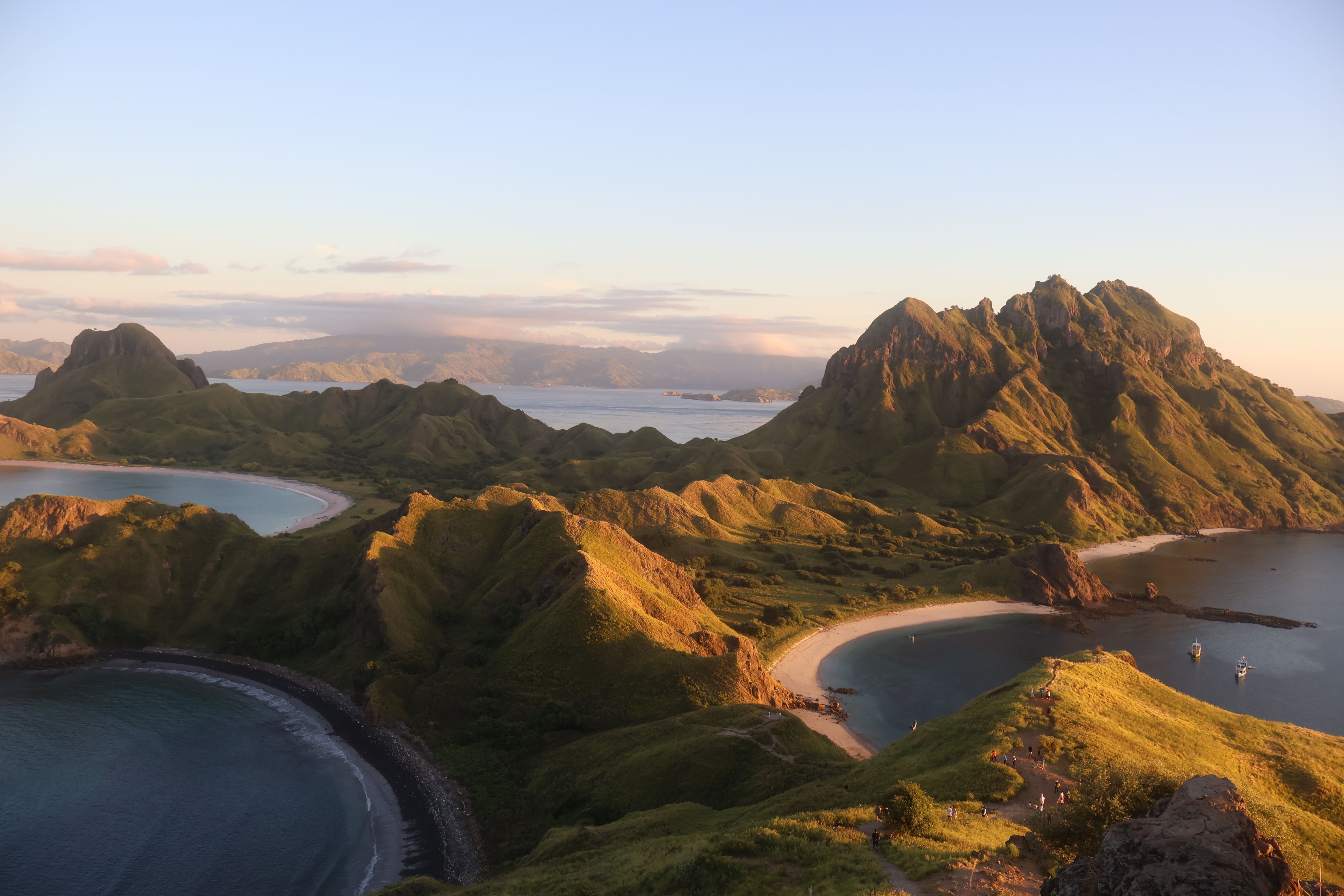
Indonesia
Everything you need to know before taking a tour around the Komodo Islands!
<article class="card">
    <div class="card__media">
        <img src="/assets/img/posts/asia/komodocover.jpg" alt="Aerial shot of the Komodo Islands">
    </div>
    <div class="card__body">
        <p class="eyebrow">Indonesia</p>
        <h3 class="card__title"><a href="#">Komodo Island Tour</a></h3>
        <p class="card__excerpt">Everything you need to know before taking a tour around the Komodo Islands!</p>
        <p class="card__meta">8 May 2025</p>
    </div>
</article>
Horizontal cardsidebars, related posts, search results
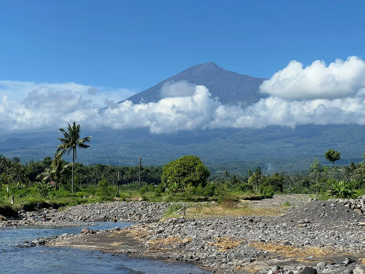
Everything you need to know before riding around Lombok!
<article class="card card--horizontal">
    <div class="card__media">
        <img src="/assets/img/posts/asia/lombokcover.JPEG" alt="A waterfall in the hills of Lombok">
    </div>
    <div class="card__body">
        <h3 class="card__title"><a href="#">Lombok by Motorbike</a></h3>
        <p class="card__excerpt subtle">Everything you need to know before riding around Lombok!</p>
    </div>
</article>
Overlay cardfor hero-adjacent features only — text over photography needs the scrim
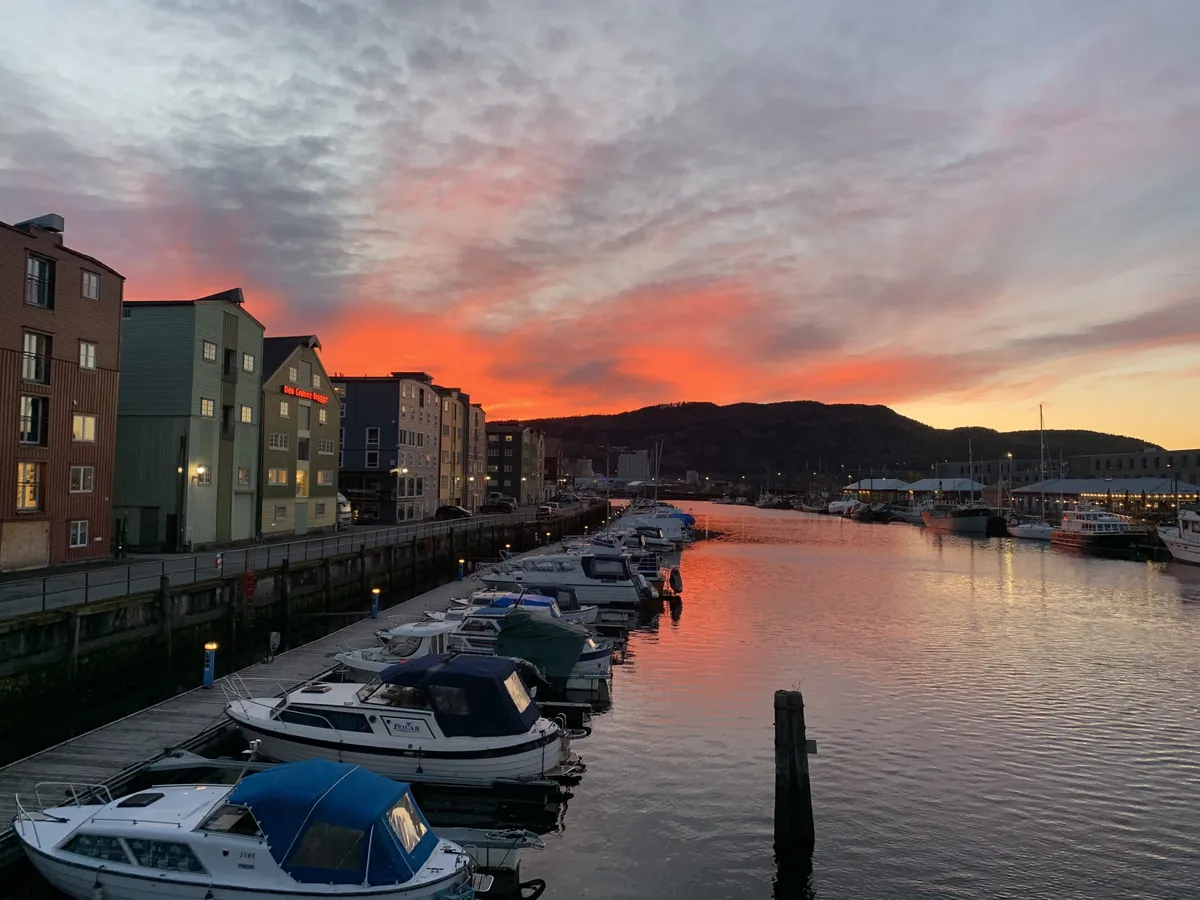
<article class="card card--overlay">
    <div class="card__media">
        <img src="/assets/img/posts/europe/IMG_7233.jpg" alt="Orange sunset over a Norwegian harbour">
    </div>
    <div class="card__body">
        <p class="eyebrow">Itinerary</p>
        <h3 class="card__title"><a href="#">Nine Months in Europe</a></h3>
        <p class="card__excerpt">How we planned and executed our entire nine month Europe trip.</p>
    </div>
</article>
Boxed cardtext-only cards: tools, resources, calls to action
Tool
Track every euro and rupiah so the money lasts as long as the trip does.
<article class="card card--boxed">
    <div class="card__body">
        <p class="eyebrow">Tool</p>
        <h3 class="card__title"><a href="#">How to Use the Budget Sheets</a></h3>
        <p class="card__excerpt">Track every euro and rupiah so the money lasts as long as the trip does.</p>
    </div>
</article>Tall, image-led links used for continents and countries. Keep labels to two lines.
Tiles
<div class="grid grid--4">
    <a class="tile" href="#">
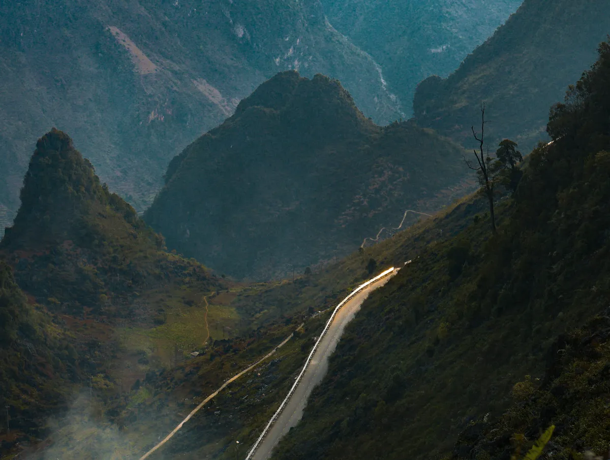
        <img src="/assets/img/posts/asia/cover.jpg" alt="Mountain road in northern Vietnam">
        <span class="tile__label">
            <span class="tile__count">6 guides</span>
            Southeast Asia
        </span>
    </a>
    <a class="tile" href="#">
        <img src="/assets/img/posts/europe/IMG_7233.jpg" alt="Orange sunset over a Norwegian harbour">
        <span class="tile__label">
            <span class="tile__count">2 guides</span>
            Europe
        </span>
    </a>
</div>Three header treatments: a photographic hero for the home page, a tinted text header for pages, and a centred editorial header for posts.
Photographic herohome page only
Guides, budgets and hard-won lessons from Europe and Southeast Asia.
<section class="hero hero--center hero--compact">
<div class="hero__media">
<img src="/assets/img/en.jpg" alt="A winding coastal road seen from above">
</div>
<div class="hero__inner">
<div class="hero__content">
<span class="hero__script">Welcome to our travel blog</span>
<h1 class="hero__title">Two people, a long way from home.</h1>
<p class="hero__lede">Guides, budgets and hard-won lessons from Europe and Southeast Asia.</p>
<div class="hero__actions">
<a class="button button--accent" href="#">Browse destinations</a>
<a class="button button--invert" href="#">Meet Daniela & Will</a>
</div>
</div>
</div>
</section>Page headerrendered by src/layouts/Page.astro from title, eyebrow and byline
Design system
A tinted header for standard pages — supplied automatically by the page layout.
<header class="page-hero">
    <div class="page-hero__inner">
        <p class="eyebrow">Design system</p>
        <h1 class="page-hero__title">Style Guide</h1>
        <p class="page-hero__lede">A tinted header for standard pages — supplied automatically by the page layout.</p>
    </div>
</header>
Post headerrendered by src/layouts/Post.astro from front matter
<header class="post-hero">
    <div class="post-hero__inner">
        <ol class="breadcrumb">
            <li><a href="/">Home</a></li>
            <li>asia</li>
        </ol>
        <h1 class="post-hero__title">Komodo Island Tour</h1>
        <p class="post-hero__byline">Everything you need to know before taking a tour around the Komodo Islands!</p>
        <ul class="meta-line post-hero__meta">
            <li>By Daniela and Will</li>
            <li><time datetime="2025-05-08">8 May 2025</time></li>
            <li>9 minutes to read</li>
        </ul>
    </div>
</header>Notices are generated automatically from markdown blockquotes. Callouts are hand-written for tips, packing lists and budgets.
Noticewrite this markdown — the notices transform builds the box
Tip: Arrive in Labuan Bajo at least one day before with enough time to get everything sorted.
Warning: The national park entry fee is not always included in the tour price.
> ❕ Tip: Arrive in Labuan Bajo at least one day before with enough time to get everything sorted.

> ⚠ Warning: The national park entry fee is not always included in the tour price.
Callout
What to pack
Reef-safe sunscreen, a dry bag and more cash than you think you need — there is no ATM on the boat.
<div class="callout callout--accent">
    <p class="callout__title">What to pack</p>
    <p>Reef-safe sunscreen, a dry bag and more cash than you think you need — there is no ATM on the boat.</p>
</div>
Callout, inverted
Our verdict
Worth every rupiah. Book the overnight tour and sleep on the boat.
<div class="callout callout--invert">
    <p class="callout__title">Our verdict</p>
    <p>Worth every rupiah. Book the overnight tour and sleep on the boat.</p>
</div>Long guides open with a jump list. Wrap the heading and list in .toc.
Table of contents
<div class="toc">
    <h3>Table of Contents</h3>
    <ul>
        <li><a href="#get-there">How to Get There</a></li>
        <li><a href="#tour">What to Look for in a Tour</a></li>
        <li><a href="#length">How Many Days</a></li>
        <li><a href="#route">The Route</a></li>
    </ul>
</div>Pill-shaped inputs to match the buttons. Always pair an input with a visible label.
Fields
<div class="stack">
    <div class="field">
        <label class="field__label" for="sg-email">Email address</label>
        <input class="input" id="sg-email" type="email" placeholder="you@example.com">
        <span class="field__hint">We only email when there's a new guide.</span>
    </div>
    <div class="field">
        <label class="field__label" for="sg-select">Destination</label>
        <select class="select" id="sg-select">
            <option>Southeast Asia</option>
            <option>Europe</option>
        </select>
    </div>
    <div class="field">
        <label class="field__label" for="sg-message">Message</label>
        <textarea class="textarea" id="sg-message" placeholder="Ask us anything"></textarea>
    </div>
    <div class="field">
        <label class="field__label" for="sg-error">Email address</label>
        <input class="input input--invalid" id="sg-error" type="email" value="not-an-email">
        <span class="field__error">That doesn't look like an email address.</span>
    </div>
</div>The closing block on the home page. Use the inverted variant when it follows a light section.
Newsletter
<div class="newsletter">
    <p class="eyebrow">Stay in touch</p>
    <h2 class="newsletter__title">New guides, straight from the road</h2>
    <p class="newsletter__lede">We post when we've actually got something worth saying.</p>
    <form class="newsletter__form">
        <div class="field">
            <label class="field__label screen-reader-text" for="sg-news">Email address</label>
            <input class="input" id="sg-news" type="email" placeholder="you@example.com">
        </div>
        <button class="button button--accent" type="submit">Subscribe</button>
    </form>
    <p class="newsletter__note">No spam. Unsubscribe whenever.</p>
</div>Everything inside a post body is wrapped in .prose. It is a named-line grid: text sits in the content column (760px), figures and embeds widen to wide (1440px), and anything with .bleed spans the full viewport. Plain markdown needs no wrapper divs.
There is no way to arrive directly in Komodo — instead you will need to fly or ferry into Labuan Bajo, a city on a nearby island. There are many flight options available, leaving from Jakarta, Bali, or Lombok, so pick whatever fits best with your itinerary.
Prices in person are much better than online — just make sure you have enough cash. We ended up getting an overnight, semi-private tour for 1,600,000 IDR per person.
We would do this again in a heartbeat — but we would book the overnight boat.
Daniela
Inline code looks like --space-m, and highlighted text uses the accent wash. Small print sits in a smaller size.
A muted closing note, set with .subtle.
Article shellthe structure src/layouts/Post.astro produces
<article class="hentry post">
    <header class="post-hero">…</header>
    <div class="entry-content prose">
        <!-- markdown output drops straight in here -->
    </div>
    <footer class="post-footer">…</footer>
</article>Always use the image shortcode — it generates AVIF/WebP, responsive sizes and the figure wrapper. Inside a post it automatically widens past the text column.
Figure with captionsrc, alt, sizes, caption, classes, loading, fetchpriority, decoding
<Figure
    src="/assets/img/posts/asia/komodocover.jpg"
    alt="Aerial shot of islands surrounded by beaches and blue water"
    sizes="100vw"
    caption="Beautiful aerial shot of the Komodo Islands"
/>
Photo credit overlay
Passing a caption also makes the shortcode inject the Shutterstock credit chip — the .bottom-left-text pill in the bottom-right of the photo, linking to both of our portfolios. It is an affiliate placement, so don't remove it and don't skip the caption on our own photographs. A captioned figure becomes a two-row grid (image, then caption) with the chip sharing the image cell, which keeps it inside the photo no matter how long the caption runs. It hides below 48rem, where it would cover too much of the picture.
| Column | What lands there |
|---|---|
content | Paragraphs, headings, lists, quotes, callouts — the default |
wide | figure, embeds and any element with .wide |
full | Elements with .bleed — edge-to-edge, use rarely |
Tables scroll horizontally on small screens rather than squashing. Code blocks use the indigo-ink background from the syntax theme.
Table
| Route | Duration | Cost (IDR) |
|---|---|---|
| Labuan Bajo → Padar | 4 hours | 1,600,000 |
| Padar → Pink Beach | 1 hour | included |
| Park entry fee | — | 600,000 |
<table>
<thead>
<tr><th>Route</th><th>Duration</th><th>Cost (IDR)</th></tr>
</thead>
<tbody>
<tr><td>Labuan Bajo → Padar</td><td>4 hours</td><td>1,600,000</td></tr>
<tr><td>Padar → Pink Beach</td><td>1 hour</td><td>included</td></tr>
<tr><td>Park entry fee</td><td>—</td><td>600,000</td></tr>
</tbody>
</table>Code blockhighlighted by Shiki, the same pipeline markdown code fences use
.card__title a {
    color: inherit;
    text-decoration: none;
}
.card__title a {
color: inherit;
text-decoration: none;
}The layouts read these keys. byline and heroImage are what make a post look right in the card grids — never ship a post without them.
Required keys
---
title: Komodo Island Tour
date: 2025-05-08
author: Daniela and Will
tags:
 - asia
 - southeast-asia
 - planning
draft: false
byline: Everything you need to know before taking a tour around the Komodo Islands!
heroImage: /assets/img/posts/asia/komodocover.jpg
heroImageAlt: Aerial shot of islands surrounded by beaches and blue water
seo:
  title: The Best Way to Visit the Komodo Islands in 2025
  description: Everything you need to know before taking a tour from Labuan Bajo.
---
| Key | Where it shows up |
|---|---|
title | Post header, card titles, browser tab |
byline | Post lede and every card excerpt |
heroImage / heroImageAlt | Card media on the home page, countries page and related posts |
tags | Breadcrumb (first tag) and the tag pills in the post footer |
seo.title / seo.description | Title tag, meta description, Open Graph |
eyebrow | Pages only — the kicker above the page title |
The site is built bilingual (English and Spanish). Posts live under src/content/posts/<lang>/ and pages under src/pages/<lang>/; every string of interface chrome comes from src/data/translations.ts. Never hard-code UI text in a layout or component — a Spanish reader sees the same template you do.
| Helper | Use it for |
|---|---|
t(lang) | Any interface string. t(lang)('footer.explore'). Supports substitution: t(lang)('post.by', { author }). A missing key throws at build time rather than rendering empty. |
localeUrl | Internal links. Rewrites /about/ to /en/about/ for the current language. |
localeFallbackUrl | For pages that exist in only one language. Returns the current language's URL when that page is translated, and the default language's when it is not, so a link can never 404 from the other locale. |
localeLinks | The translations of the current URL, for hreflang tags and the language switcher. |
getPosts(lang) | Posts in one language, newest first. Drafts are included by astro dev and excluded from astro build. |
formatDate(date, lang) | Localised dates, formatted in UTC so a bare YYYY-MM-DD never slips a day. |
Linkingevery internal link goes through a locale filter
<!-- a link to a page that exists in every language -->
<a href={localeUrl('/about/', lang)}>{t(lang)('header.home')}</a>

<!-- a link to an English-only page, safe from every locale -->
<a href={localeFallbackUrl('/affiliates/', lang)}>
    {t(lang)('footer.affiliates')}
</a>
Language switchcurrent locale is solid, available locales outline, untranslated pages dashed and disabled
<div class="switch-language">
    <a href="#" lang="en" hreflang="en" aria-label="EN: English" aria-current="page" class="current">EN</a>
    <a href="#" lang="es" hreflang="es" aria-label="ES: Spanish">ES</a>
    <span aria-label="FR: French" class="disabled">FR</span>
</div>
Adding a string
Add the key to both the en and es blocks of src/data/translations.ts, then reference it with t(lang). TypeScript checks the two trees against each other, and a lookup that misses throws during the build — so they cannot silently drift apart.
The mistakes that will make a new page look off-brand.
Use --accent-deep when terracotta carries text.
Set body copy in --accent — it fails contrast on white.
Give every section an eyebrow and a heading.
Stack two tinted sections in a row — alternate them.
Reach for the image shortcode for every photograph.
Drop in a bare <img> — it skips the responsive sizes.
Use the script face for one short flourish per page.
Set headings or paragraphs in Bad Script — it is unreadable at length.
Add new values as tokens in variables.css and document them here.
Hard-code a hex, px size or radius inside a component.
Put interface text in translations.js and pull it with translate.
Type English chrome straight into a layout — it leaks onto the Spanish pages.